|
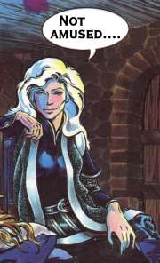
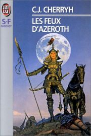
| Above: Morgaine as depicted in the Cherryh/Fancher graphic novelization of Gate of Ivrel. |
Gladiator Doilies: The Odd Phenomenon of 'Fantasy Armor'
|
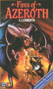
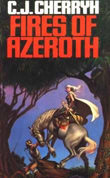
A few years ago I bought a book for no reason except the outrageous cover. The book is the British paperback edition of C. J. Cherryh's heroic fantasy, Fires of Azeroth (Volume Three of The Morgaine Saga, which I have reviewed elsewhere). The cover was so utterly, ludicrously out-of-touch with the book's content that I laughed out loud when I saw it. And I had to have it.
What's wrong with it? Oh let's see; where to begin? The purple thingie she's hacking at is some sort of dragon/pterodactyl whatsit. None of them in the book, and no big battle in the air. (It's flying. Is she?) The sword is a clunky, dinged metal bastard from Swords 'R' Us rather than the matter-sucking Toledo/katana elegance, her black-hole-infested demon sword Changeling. And the buckler, which she wouldn't be carrying anyway because she doesn't need one when she is using Changeling, is inexplicably strapped to her sword arm. Her hair and skin are the wrong color. And the costume — well, uh.... Where to begin?
The image on the right, on the other hand, from Cherryh's own graphic novelization of the first book in the series, Gate of Ivrel (speech bubble added by me, though), may communicate a bit of the problem. It was drawn by Jane Fancher, Cherryh's friend and companion, a professional graphic illustrator (Elfquest) and a fantasy author herself (Dance of the Rings). She worked to Cherryh's instructions, specifications, and corrections. (Cherryh sells the graphic novel at her site, a bargain for $12.00 — two volumes, signed by Fancher and Cherryh. For a discussion of the creation of the graphic novel, go to Fancher's site.) Fancher's Morgaine is in her civvies, after shedding plate, cuirbouilli and mail for the evening, but I think you get the idea.
For comparison to the laughable British cover, take a look at the images the great Michael Whelan settled on to depict Morgaine Anjhuran for two of the paperback originals, Well of Shiuan (right) and Fires of Azeroth (left; both, U.S. covers for DAW Books).

|

|
One of the strangest offshoots in the development of feminist consciousness in pop culture must be the rapid evolution of "fantasy armor." It began, I think, with the gradual blooming of the sexist "naked chick in jeopardy" into the pseudo-non-sexist "naked chick in jeopardy with a sword." From there artists moved pretty quickly to "naked people of both genders who are menacing something or other and also are decorated with some very sexy stuff that looks a bit like armor." Welcome to VallejoLand.
Understand, what I mean by "fantasy armor" is not the standard meaning. In the circles that discuss these things (the Society for Creative Anachronism, to be exact), a distinction is made between "historical" and "fantasy" armor, but the primary basis for the distinction is historical precedent. That is to say, some Medieval armor is pretty fantastic, bordering on phantasmagoric, as is most Japanese armor of the Samurai era, but it was worn and used by warriors of its time. Other contempory styles of armor are pure invention — ergo, fantasy. There is an excellent essay by a fellow who takes his armor very seriously indeed, "Sir Adam" at MedievalMan.com.
Sir Adam defines "fantasy armor" as essentially armor that elevates form over function, regardless of historical source. The distinction gets a bit fuzzy because historical armor, after all, was a tool and therefore even the most "fantastic" armor was likely to be functional. And conversely, any armor that is unfamiliar is inherently "fantastic" — witness the European reaction to Japanese armorial conventions ("Armor made out of thin little strips? Heh heh") or to the quilt armor of the Aztecs (designed to protect against ripping attacks by serrated glass blades, and thus not terribly functional versus Toledo steel slices and puncturing bullets). Both were functional in context and are fantastic, in the literal sense, out of context. Similarly, the apparently ornamental curls and spikes of real European armor often, upon examination, reveal their functional value.
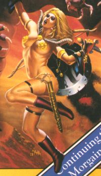
What I have in mind, when I say "fantasy armor," is something a bit more extreme than what Sir Adam describes, an approach to armor that abandons functionality altogether, what I'm going to enjoy calling "Gladiator Doilies." This is armor that goes the full route and serves as nothing but decoration. And in its worst form, it is decorative with the ludicrous pretense of functionality. Mistress Morgaine of the UK is a pretty good example of this phenomenon.
Consider, please, for a few focused moments, the utter and complete silliness of just her outfit. (Never mind the pose, etc.) She is wearing:
|
|
|
|
- One gold chain G-string/string bikini. At least I think it's a G-string. Ok, I hope it's a G-string. It may just be the belt for her scabbard.

- Deluxe gold full-aureole studded pasties.
- A plush collar with pastie-coordinated gold clasp that appears to be very comfy but does not appear to come with an accompanying cape or, for that matter, to attach to anything.
- A gold filigree tiara.
- A gold bracelet on each arm. The one on the left arm has two cute dangly things on it that might be pearls or benwa balls.
- Leather garter straps with no apparent function. They aren't holding anything up; they aren't holding anything down.
- Plastic, seam-less, lace-less, sole-less, heel-less, texture-less, zip-less form-fitting boot thingies. Possibly thick nylon stockings? "Girl! Where did you get that footwear? Big Lots?"
- Generously large gold earlobe guards. (A girl can't be too careful.)
- Eyeshadow that matches her monster.
- A tacky base metal shield on her sword arm. One can only hope that the display side is better coordinated than the interior.
In a word, she is the poster girl of non-functional body ornamentation. It is as if the artist were trying to make that point. The poor woman is carrying her shield on her sword arm, for Heaven's sake! And the sheath is on the wrong side as well.... She is about as close to non-armored as one can be and still set off a metal detector. To say of the artist, "What was he thinking?" is to ascend the Olympian heights of rhetorical questions.
Disclaimer: No Snits!Please, before you launch the "Who do you think you ARRRRE?" flame, understand that I am not attacking anything here. At least that isn't my intention. (Aside from having some fun with the UK Morgaine guy.) And I'm not saying there is no place for Vallejo art (a nice, non-threatening word for the noncoherent prettiness that I'm trying to identify with the UK Morgaine). That would be like being against dessert. And calling it dessert isn't deprecation, either. Recently I found myself looking at the insider view — that "other people" don't get it, don't appreciate it, are prejudiced, are snobs — and giving that dismissive view some thought. If you like, I found myself addressing the question, Why is it just dessert? I agree that it is boneheaded and narrow-minded (euphemisms for "stupid") to dismiss content and form categorically, as in "You read science fiction? I didn't know people with real literary taste did that," or "Mystery novels? You don't seem like a violence junkie," or "Westerns are for arrested adolescents," or "Can you take a writer seriously who got her start writing bodice rippers?" But is that really what the problem is — ignorant prejudice? What about the people who are open-minded, but still don't "get it"? Or the folks like me, who get it, and enjoy it, but end up having to sheepishly explain some "strange bedfellows"? What I'm trying to do here, in a very non-rigorous, informal way, is to propose an aesthetic that seems sensible and helps true believers and Philistines discuss their differences. I have my own principles which you may not agree with. Related to this topic, here is a key one. As a writer, I feel obliged to practice a discipline as well as a craft. I recently had a lengthy discussion with a sympathetic reader who said, of a key moment in a story of mine and the protagonist's actions at that point, "He wouldn't do that!" And the more I thought about it, the more I agreed. She was right. I had forgotten, for plot reasons, my obligation to let the characters be themselves. So I had to fix the story. That is what I mean by discipline. |
Setting aside for a moment that complete lack of connection to the novel or the main character, what is wrong with this picture? It's ridiculous? Yes, but it's a special kind of ridiculous.
The Content Shift:
From Frazetta to Vallejo
There is a huge content shift when you go from the powerful fantasy cartoon images of Frank Frazetta to the airbrushed mineral oil fantasies of Boris Vallejo. Because of that, I think of Vallejo as inventing this odd variety of art. I don't mean that ornamental armor originated with him. I can trace ornamental armor at least back to the European Baroque without even breaking out in a sweat. But armor that is more than non-functional, actually anti-functional? With Vallejo, "armor" became nothing but elaborate forms of ornamentation. For many of his pictures the only difference between "armor" and naked skin is coloring — as if the armor were made of metallic paint. Not to say I don't like looking at Vallejo's stuff. But it always looks like studio stagings because, well, it's studio stagings. I much prefer Frazetta.
One reason it took so long for Science Fiction and Fantasy to get recognized as legitimate literary forms is the genre's reputation for self-indulgent frivolousness. No respectable mystery writer would commit a murder in a locked room and then not tell us how it could have happened. If one did, he'd be hooted from the club. But in the world of fantasy, even more than in the world of science fiction, there is a common perception that "anything is possible."
This perception, I hasten to add, is anathema to most good science fiction writers, who can be embarrassed by public exposure of a technical failure or consistency error, and also to good fantasy writers, who generally take pride in "getting their elves and faeries right." Oh, and what I mean by "good" is "respected among their own kind," so to speak.
If you ask with regard to the UK Morgaine, "How in the name of God could anyone have gotten herself into the situation on that cover?" too many fantasy fans will mutter "Philistine" and make "avert" gestures at you. Face it; it's a legitimate question, even if the answer isn't as foregone as the questioner might think.
We can't argue with them, though — the questioners or the "I can't hear you I can't hear you" responders. Most of the time, they don't want to argue, just assert. I'm willing to concede, if the latter group insists, that there's nothing "wrong" with art that refuses to conform to even its own inner logic. But I'm also sympathetic to the views of the questioners, even if I'm pretty open-minded about acceptable answers. To keep my attention, there must be some acknowledgement that reality is out there somewhere, even if it looks a bit different than I thought and has creatures in it that I didn't know about.
Morgaine of the Mystic G-String up there is silly precisely because the artist is not thinking in a context. What is she doing? How did she come to be suspended in midair? Why did she dress up like that? How is it that the dragon thingie is besmirched with blood (suggesting she's been hacking at it for some time) and yet her hair isn't mussed, much less her Dorset tan marred with the odd scratch? Why would a bird with bespoke clothes settle for an Army Surplus sword and shield?
What Is Missing? Coherence
I am not arguing for functionality here. I'm arguing for a sense of coherence. Ornamental armor is often quite lovely, and I confess that this UK Morgaine is "easy on the eyes," downright plummy unless you favor the Dachau Spa look of current models and stars. But what is the context for this picture? "I dreamed I fought a dragon in gold foil pasties"?
I dreamed I fought a dragon in gold foil pasties!
When the justification for an artistic image is simply, "Wouldn't it be neat if..." then we are dealing with pretty trivial art and even, frankly, trivial craft. To illustrate, let me direct your attention back up to the armor Michael Whelan invented for Morgaine, as shown above. He has maintained essentially the same "look" for the two books. His armor is a practical compromise of weight and protection. The leg coverings, segmented like a sowbug, are hardened leather — light and reasonable protection for a fighting person on the move.

|
The resulting image is consistent both with the situation and with Morgaine's character. The only quarrel I would have with the "look" is the unlikely amount of bare skin. The graphic novel, illustrated in collaboration with Cherryh, depicts her in trousers, poet blouse, and mail, with a hardened leather tunic. This, on the other hand, is less armor than one would expect, but it's certainly more consistent with Morgaine's character (and the weather). Interestingly, Whelan has had other thoughts about Morgaine; these images are from the middle of his career of work on her. His Gate of Ivrel cover (right), a first attempt at Morgaine, belongs in the Silly Sweepstakes, with Morgaine dressed in muslin halter top and loincloth.
|
His cover for the French translation of Fires of Azeroth (left) is a painting later used as the cover for a science fiction/fantasy anthology called Amazons.

|
I would have to guess that his most recent Morgaine cover, Exile's Gate (right), is probably the most "accurate" picture of Morgaine, though I personally don't care for the "faerie" look created by the glow of the gatestuff in her hand. Face it, Morgaine is one serious hard-eyed lady. Again, though, the armor is appropriate, perfectly serviceable Renaissance plate that she could wear as a disguise if she ever got "gated" off to 16th Century Europe. It's a bit more than one might expect on people traveling light, but never mind.
If I seem to have lingered on the issue of illustrating Morgaine, I have two reasons. First, for my money, the Morgaine books are some of the finest fantasy fiction out there, the best work of one of our best writers in the genre, C. J. Cherryh, and second, because the UK cover, and the contrast between that cover and the professionalism that Whelan brought to a similar task, so beautifully illustrate the point I am working toward, which is the rationale for coherence in fantasy art.
I guess I'd better get on with it.
What Is "Coherence"?
I have been hesitant to call what I am talking about "seriousness," because that suggests "humorlessness," and I don't mean to suggest anything so pedestrian as that. By "coherence" I mean some evidence that the illustrator is asking questions about his or her work and answering them, taking that internal dialog seriously.
Seriousness is not the same thing as humorlessness, any more than coherence is realism.
For example, a man is going into battle wearing full plate, cumbersome plate at that, but he chooses to have a bare midriff? Why would he do that? How much does his helmet weigh? Is a woman with bare breasts that size ("Posersize me!!") likely to be running that fast, that effortlessly? If he actually swings that hammer, how is he going to control the centrifugal force? Spoilsport questions, every one, but they are what separate trivial art from art that speaks to its readers, art that engages them in a dialogue consisting of questions for which the answers are more thoughtful than "Cause I wanna."
A contributor at Renderosity (Nerd3D) refers to his stuff, both armor and other, as the "totally impractical" line — truth in (tongue-in-cheek) advertising. Another (Xurge) calls his armor "jewels." And my personal favorites, the most gloriously over-the-top items of this sort, are Daio's "Jewels" line of armor textures. Taking her lead from Xurge, Daio bypasses the term "armor" entirely, calling her textures "jewelry" plain and simple.
The Lace Jewels illustrate the point I am making about coherence. Look closely at the design of the halter on the left.

|
|
Gold & Ruby Lace Jewels |

|
|
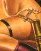
Sensual Jewels |
For contrast, here's a detail from the advertising for Xurge's Sensual Jewels armor kit. All that woman has to do is sneeze, and she's going to have two nasty cuts.
Keep in mind that this is an "apples and oranges" comparison to a degree, because the Sensual Jewels are objects, and the Lace Jewels are textures. The appearance of the Xurge's various Body Jewels (the Sensual Jewels are just one example) can be softened and detailed beautifully by a well-designed texture. By the same token, the VCFS armor that the Lace Jewels are "painted onto" (Victoria's Changing Fantasy Set, by Anton Kisiel) looks crude without Daio's textures, and Xurge's armor textured brilliantly looks great.
The essential difference between the two sets of "jewelry" is one I can best describe subjectively. Daio's looks like something a woman would design to wear (in reality or her fantasies); Xurge's Sensual Jewels and Body Jewels look like they were designed for a woman to wear, without consulting her preferences. They are "slave" garments, if you will. Are they meant to be? No. The figures modeling them are referred to as "warriors," "amazons," and "princesses." Fully ornamented with a delicate, flattering texture, the Sensual Jewels can look like something a woman might choose to wear. But the difference remains, I think.
And the difference is observable in the Anton Kisiel base objects for the Lace Jewels as well. The contrast is striking. The VCFS armor kit is "real" armor, which a person might choose to wear for its functional value. What Daio's textures do to it is a bit of magic. Similarly, the other common set of functional fantasy armor, Traveller's kits at BBay, provide a working base that is functionally realistic. The Xurge designs, even the true "armor" designs, whatever their merits, are essentially ornamental, and their use in a "workplace" setting is problematic.
Coherence Is Narrative
I don't mean by "narrative" that pictures must tell a story. I mean that the picture is a narrative by the artist addressing the viewer, a dialog between artist and viewer, if you like. The dialog is often non-verbal, but it exists. To illustrate, let me construct an image verbally, an imaginary picture.
Among my prized possessions are the Belly Dancer costumes (the Fantasy Dancer, Belly Dancer Mappak, and RPD Mappak) and poses available some years ago at DAZ3D. I won't go into the reasons I like them, since I've devoted an entire essay-review to the subject. Thinking about the issue of narrative coherence, I found myself constructing an image of the dancer in her filmy gauzes and jewelry in one of those graceful, confident, frozen moments Digiport Designs has captured so accurately with their poses, but posed in a snowscape, perhaps with an igloo or an Alaskan wolf (black, of course) in the picture. At first, I thought that would work as an example of the kind of incoherence I am talking about, but almost immediately I came up with a narrative — an explanation, if you like — that allowed me to make coherence of the image. This morning, I put galoshes on her bare feet, and the narrative of the image changed completely. Now it is either comic or incoherent. And in any case, the viewer reaction is highly subjective, no matter how the picture is executed. Perhaps the wolf contributes to a serious image, but the igloo, like the galoshes, makes the image comic. In any case, I had a message, represented partially in this narrative, and you saw some of it.
Shift back to the UK Morgaine now, and I will give you a "narrative" I think goes with it. The artist wanted to show as much flesh as he could get away with. Boots are really sexy, though. He knew Morgaine was a heroine with a sword. "Fires" made him think of volcanoes and fire-breathing dragons. Cool beans. Most people are right-handed, so they wear their scabbards and shields on the left side. But wait; if she holds her sword in her right hand, either she will have her back to the viewer, or the shield will cover her body. In a word, no boobs, unless I completely redesign the whole picture. (A backhand would've solved this one, by the way.)
 Zoom
In
Out
Zoom
In
Out
|
There is more than one underlying narrative for Whelan's Morgaine covers.
In contrast, here's one underlying narrative for Whelan's Fires cover (right; click to zoom on Morgaine). Note that there are, in fact, at least two narratives for that cover.
Whelan, unlike the UK artist, has connected his illustration to the book's narrative. His Well of Shiuan cover goes a step further in that it actually depicts a specific scene in the novel. The Whelan Fires narrative parallel to the one proposed for the UK Morgaine goes more like this:
Key elements of Morgaine's image are identified. She has white but not albino coloring, wears black armor and garb with a large, light-colored fur cape, and has a commanding, mysterious presence. Key elements of her character are her relationship with the horse Siptah, a gray stallion, her relationship with Vanye, who is a beloved encumberance as much as he is a boon companion, her protectiveness about the sword Changeling. The setting of the novel is a forest with community clearings. Working with these details (and many more that I haven't pointed out here), Whelan creates an illustration that visualizes the novel.
The point I am making here is very subjective, but I hope you follow. I'm not demanding realism or even context, exactly. Fantasy armor can satisfy my narrative coherence criteria under certain conditions.
If in fact the narrative underneath the UK Morgaine is what I described above, then the artist is creating from trivial personal whims. That's his perogative (it is a guy, by the way; I checked), as long as I'm not expected to respond. But if this art form is dessert, the UK Morgaine is generic chocolate.
In Conclusion, What?
The usual platitudes: Art is so subjective. What do I know? Good art is better than bad art. Try to be good.
And a bit more. I've focused on "content," if you will, rather than "form" issues like skill, on purpose. I chose two paperback covers because the "form" (use of color, brush technique, accuracy of modeling) is trivialized by the medium. I can't say for sure that Whelan had in mind a saleable poster or original oil, but I'm confident that the UK Morgaine illustrator did not. The images I've analyzed are "equal" in form — paperback book covers. The reason I've focused on content is that there is a crucial, elusive essential element — elusive as the "breath of life" and just as crucial — in all good art, visual or verbal, and that essential exists within the content, no more separable from content than living bone is separable from living flesh.
It's the aesthete's bugaboo, intention: "Why are you showing me this?"
It is the aesthete's bugaboo, intention. "Why," every viewer legitimately asks, "are you showing me this?" The artist satisfies a need, an itch he must scratch: What need? He expects a reaction: What reaction? If we dismiss as Philistine the people who ask these question, then our art is onanistic (that's highbrow for jackoff pictures, folks). Art is a form of communication, and communication implies a speaker, a message, a medium, and a listener. More maybe, but never less.
There may be some overlap, but the four things are as separable and identifiable as, say, the moisture or smoke in air — medium, message, speaker and listener. The artist speaks with intent; the listener reacts to medium, content of the message, and that intention. The conflation of medium and message is easy enough to imagine, and I would have to agree that they are almost inseparable, however certain I am that they are two "things." (In the movie Wolf, Jack Nicholson's mouth is media, and his words are message. But which is his smile?)
|
|
One last thought |
However, it is when the speaker and the listener are "the same thing" that art goes completely awry. If I am not addressing "you" — regardless of your sympathy or agreement perhaps, but determined to "make myself clear" — then what is the point of writing this? And conversely, when my own investment in the art is as listener — that is to say, when you ask me to listen, whether personally or collectively — then my desires, my values, and my needs become inarguably part of your communication problem even more than they may be mine. If your art does not communicate to me, then your approach failed. That's that, and "your fault or mine" is just a post-mortem. I am not the speaker, and I am not the message. If the message is not for me, why show me? Most of us, pressed to take a side, would vote that masturbation is not a performance art.
 
|
